Entry tags:
Entry tags:
I <3 infovis
BayCHI tonight was vunderbar. I feel sorry for all of you who missed it because you had a date for Valentine's Day instead ;)
( enthusiastic infogeek babble )
( enthusiastic infogeek babble )
Entry tags:
Entry tags:
I love maps
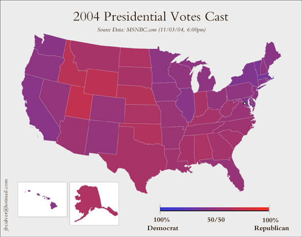
the purple map
state proportions (scroll down)
county by county
and of course, just for laughs, can't forget Jesusland :)
curious that the blue states are contiguous, no? (not to forget Hawaii, I should say all the mainland blue states)
Update, Nov 12:
cities as skyscrapers of blue
(been looking around for details of the data behind this, my google-fu is failing me, but there seems to be a consensus of doubt about its provinence... too bad, so sad)
Update, Nov 20:
Retroactively filling in the maps I was watching on election night:
NYT, check out the switch between geographic and electoral vote view.
ABC, seems pretty basic but the mouseover-popup-floater that shows elector college vote numbers as well as current status was actually useful.
BBC, very elaborate, high gee-whiz factor, auto-zooming turned out to be really annoying, as was the update feature that made states blink when they had updated numbers which was like every 5 minutes, and you had to click each state individually to get the blinking to stop, and then it would do the zoom thing... Aaaagh! (as a workaround, you could refresh the whole page, but then you had to skip past the intro every time). I guess it's a hard thing to test in advance.
There were some others, but these were the main three I switched between. NYT was interesting in part because they were super-conservative about the numbers they posted, using only genuinely confirmed results instead of projections. ABC was not the prettiest but was the most useful, and BBC gave me a point of comparison since they didn't use exactly the same projected-result figures as ABC.